Ana Vitlov is a Product Manager at Neuralab. Her expertise lies in organizing and planning product roadmaps, proposing new features, creating a variety of reports and ensuring seamless communication between the team and clients.
Imagine this scenario: You enter a shop eager to make a purchase, only to find the aisles too narrow, the signs unreadable, and the staff unhelpful. Frustrating, isn’t it? This is the virtual experience for millions of people online when web applications — portals, blogs, forums, educational platforms, social media, online stores, health trackers, food delivery services, microsites, etc. — are not designed with accessibility in mind.
Gone are the days when accessibility was merely a buzzword in the ecommerce community. It’s time to understand that it’s not just about making text machine-readable or ticking a box for compliance. Accessibility is about bridging the digital divide, making every customer’s online shopping journey enjoyable, and, most importantly, ensuring no one is left behind.
There are plenty of myths and misconceptions when it comes to accessibility, especially in the ecommerce community. If you’re new to accessibility, congratulations: this blog post is your first step to helping build a more inclusive online world.
Defining accessibility
In the world of accessibility, there are numerous barriers, and one of the first (as many individuals humorously note) is the very word we’re discussing. That’s why you’ll sometimes hear alternative words being used, such as:
- A11Y: where the number 11 replaces the 11 letters between ‘A’ and ‘Y’
- Ally: because the number 11 resemble the letters “ll”
- 13 letter word: because the word itself has 13 letters
No matter which word you use, the meaning remains the same. Some define accessibility as “the concept of whether a product or service can be used by everyone.” Others say “it’s the practice of making information, activities, and environments understandable, meaningful, and usable for as many people as possible.” Some state that “accessibility ensures that all people – regardless of ability – can interact with the information or services you provide.” The essence remains: it’s about creating products or services usable by everyone.
As an inspiring affirmation of these definitions, we have the words of Tim Berners-Lee, the inventor of the World Wide Web, from 26 years ago: “The power of the Web is in its universality. Access by everyone regardless of disability is an essential aspect.”
We’ll start with a few terms that frequently come up in discussions about accessibility:
- Web Content Accessibility Guidelines (WCAG): This is a set of guidelines and standards developed by the World Wide Web Consortium (W3C). They ensure that web applications and digital platforms can be used by a wide range of people, promoting inclusivity and expanding your potential audience.
- Americans with Disabilities Act (ADA): The ADA is a federal law in the United States that prohibits discrimination on the grounds of disability and sets standards for accessible facilities and services. ADA compliance is essential for providing equal opportunities and access to people with disabilities and for avoiding legal issues.
- Web Accessibility Initiative (WAI): This W3C initiative is dedicated to making the web universally accessible by developing guidelines and resources that empower web creators to design for all users. WAI contributes to a more inclusive online environment, ensuring that everyone can navigate and interact with digital content.
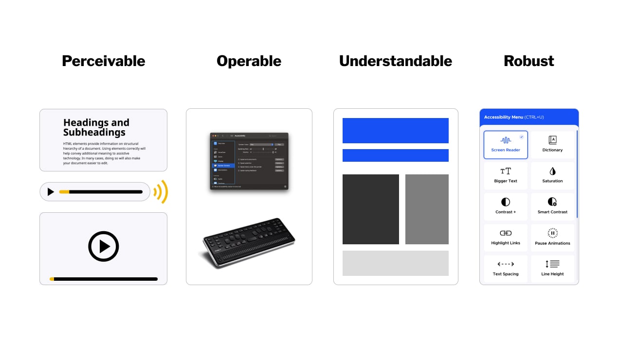
- Four Principles of Accessibility: This refers to the core principles outlined in WCAG that guide the creation of accessible content. By adhering to them, web designers enhance the overall user experience and improve the usability of websites for a broader audience. These principles state that content should be:
- Perceivable: Information and user interface components must be presented in a way that users can perceive, whether through sight, hearing, or other senses.
- Operable: User interface components and navigation must be operable and usable by all, including those who may rely on keyboards or assistive technologies.
- Understandable: Information and operation of the user interface must be clear and understandable to all users.
- Robust: Content must be robust enough to work reliably with current and future technologies, including assistive technologies.
Understanding the target audience for website accessibility
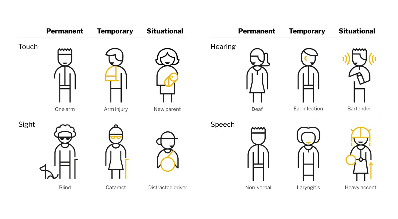
Many people mistakenly believe that accessibility is only about helping a few individuals with disabilities. This is a misconception for several important reasons:
- Fifteen percent of the world’s population has some form of disability, which means one in every six people, or one billion potential users.
- It is also important to consider that every person in the world may potentially need an accessible web one day. Even if you don’t have a disability today, your vision may deteriorate, reflexes may slow down, and your cognitive abilities may change as you age.
- Beyond permanent disabilities, situations can change, and anyone can temporarily or situationally experience a disability. Microsoft’s Inclusive Design Team perfectly describes this concept.
Accessibility in ecommerce
We’ve learned some definitions, common terms, and statistics, but what does that mean when you look at your web application? Below is a checklist of accessibility features that you can use to evaluate your store.
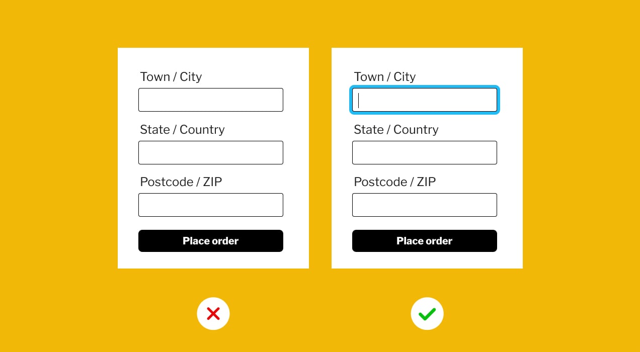
- Keyboard navigation and visual focus indicator: Ensure that users can easily navigate your web application using only their keyboard, and make sure there’s a clear indicator showing where their focus is on the screen.
- Color contrast: Use high contrast colors to make text and important information stand out against the site background. Use the colors strategically to avoid confusion.
- Strategic color use: This refers to choosing colors to convey specific meanings or information. For example, red often signifies warnings, green represents approval or success, blue is commonly used for links, and yellow can symbolize caution or attention.
- Image alt text: Add descriptions to images so that customers with visual impairments can understand what the images represent.
- Content structure and headings: Organize your content with clear headings and a logical structure to make it easier for all users to follow.
- Font size and font style: Choose fonts that are characterized by clear, well-defined letters with sufficient spacing between characters, and allow users to adjust text size to suit their preferences or needs.
- Fillable form fields: Make sure that all form fields have descriptive and user friendly labels to make it easy for users to input information.
- Video captioning: Include captions for videos to help users who are deaf or hard of hearing, or who may not be able to listen to sound due to environment or circumstance.
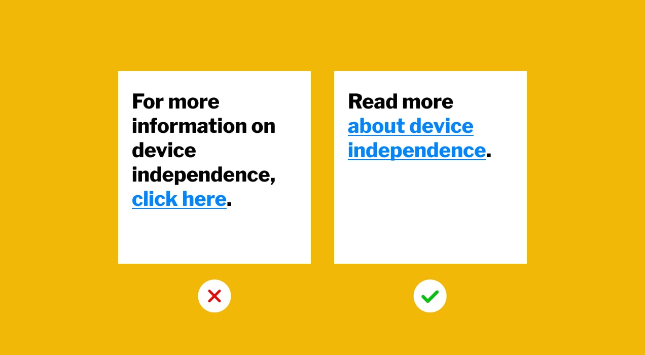
- Descriptive links: Use clear and descriptive link text (“more information can be found in this blog post,” instead of a generic “click here”) to provide context for screen readers.
- Responsive design: Ensure your web application is responsive so that it adapts well to various screen sizes, making it accessible on both large monitors and small mobile devices.
Benefits of implementing accessibility in ecommerce
While implementing accessibility and maintaining accessible content may seem daunting, the benefits are worth the effort. By embracing these principles, you’re not only providing equal access to your products and services, but also establishing your brand as a place of inclusivity and innovation in the competitive world of ecommerce.
Now, let’s talk about the good things that come with maximizing accessibility efforts:
- Legal obligation: If you implement the necessary measures, you will ensure compliance with legal regulations, reducing the risk of costly lawsuits and fines. There’s an example from the United States where a blind man won a case against Domino’s Pizza because he couldn’t order pizza online.
- Ethic duty: Prioritizing accessibility demonstrates your commitment to inclusivity and social responsibility. When you make your online store accessible, you not only avoid excluding potential customers but also build a reputation as a business that cares about everyone’s needs and fosters a sense of belonging.
- Improved SEO: Enhancing accessibility can positively impact your search engine ranking. Search engines reward web applications that offer a better user experience, including accessibility features, which can lead to increased visibility and more organic traffic.
- Increased traffic: An accessible online store is more inviting to all users, resulting in higher traffic as more people can comfortably engage with your shop. This can translate into more sales and conversions.
- Larger audience: Accessibility expands your potential customer base to include people with disabilities (permanent, temporary, or situational), who make up a considerable portion of the population. By catering to a diverse audience, you reach out to an often overlooked market, expanding your potential sales.
- Revenue growth: By making your web application accessible, you’ll reach an often-underserved market. This can lead to a significant boost in sales as your online store becomes more welcoming for a diverse range of customers.
- Better user experience: Accessibility improvements create a user-friendly environment for all visitors. This means smoother navigation, quicker load times, and enhanced usability, leading to higher customer satisfaction and increased loyalty.
Examples of accessibility in ecommerce
Common accessibility mistakes
To help you build an inclusive online store, here are some examples of common accessibility mistakes:
- Missing alt text: Failing to provide (alternative) descriptive text to images prevents screen readers from communicating the image’s content to users.
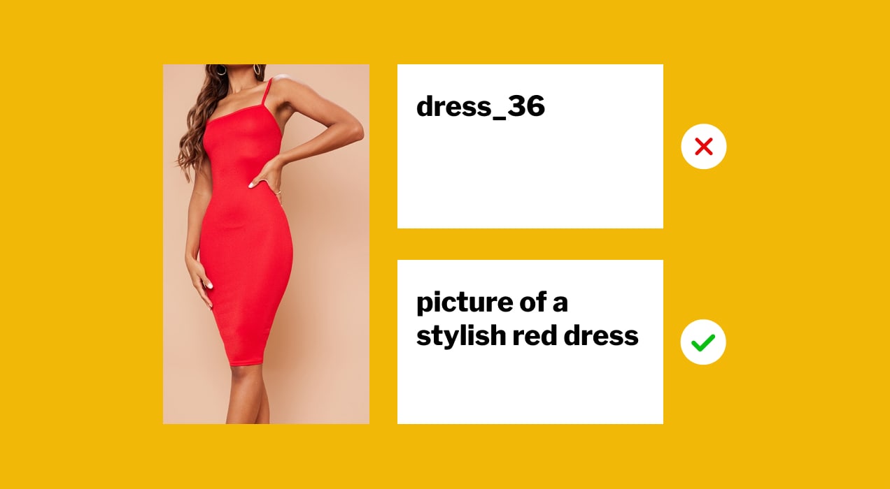
Example: On your online clothing store’s product page, there’s a picture of a stylish red dress. Alt text is “dress_36” which leaves blind or visually impaired shoppers without relevant information. They won’t be able to make an informed purchase on your site, and therefore won’t make a purchase from you at all.
- Unclear links: Using unclear link text makes it hard for users to understand the purpose of the link.
Example: “For more information, click here” doesn’t provide context about the linked content.
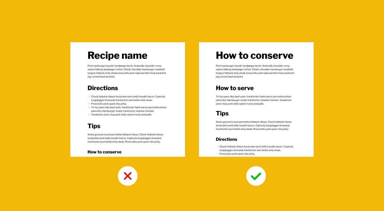
- Bad heading structure: Failing to organize content with proper headings can confuse screen reader users and those who navigate using headings.
Example: Incorrect heading structure on a recipe post:
- H1 How to conserve
- H2 How to serve
- H2 Tips
- H3 Directions
- H3 Name of the recipe.
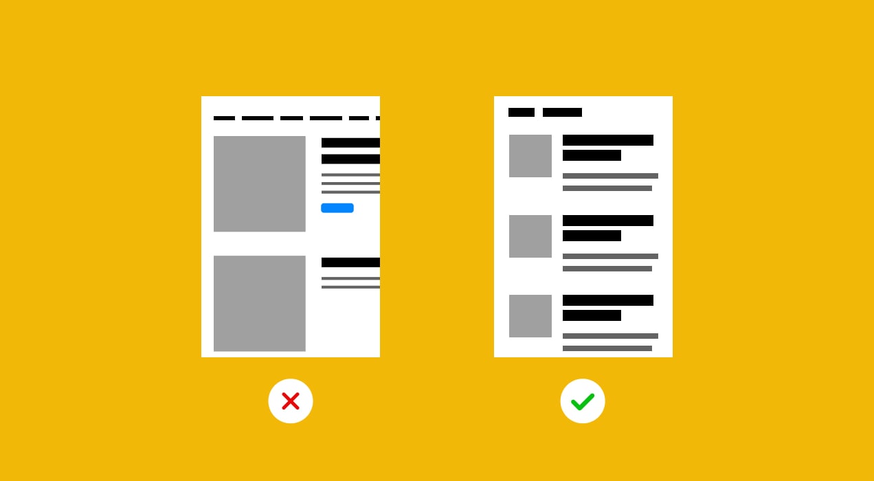
- Non-responsive design: Not optimizing your site for various screen sizes and devices.
Example: When trying to access a restaurant’s web application on a tablet, the menu items are cut off, and customers can’t view the full menu, leading to a frustrating user experience and potentially causing them to look for dining options elsewhere.
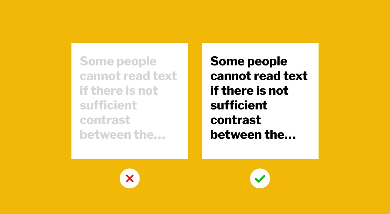
- Low-contrast text: Using low contrast between text and background colors can make content illegible for individuals with vision impairments.
Example: Product descriptions are displayed in pale gray text on a light beige background, making it nearly impossible for any customers to read the information about the products they’re interested in, resulting in a potential loss of sales.
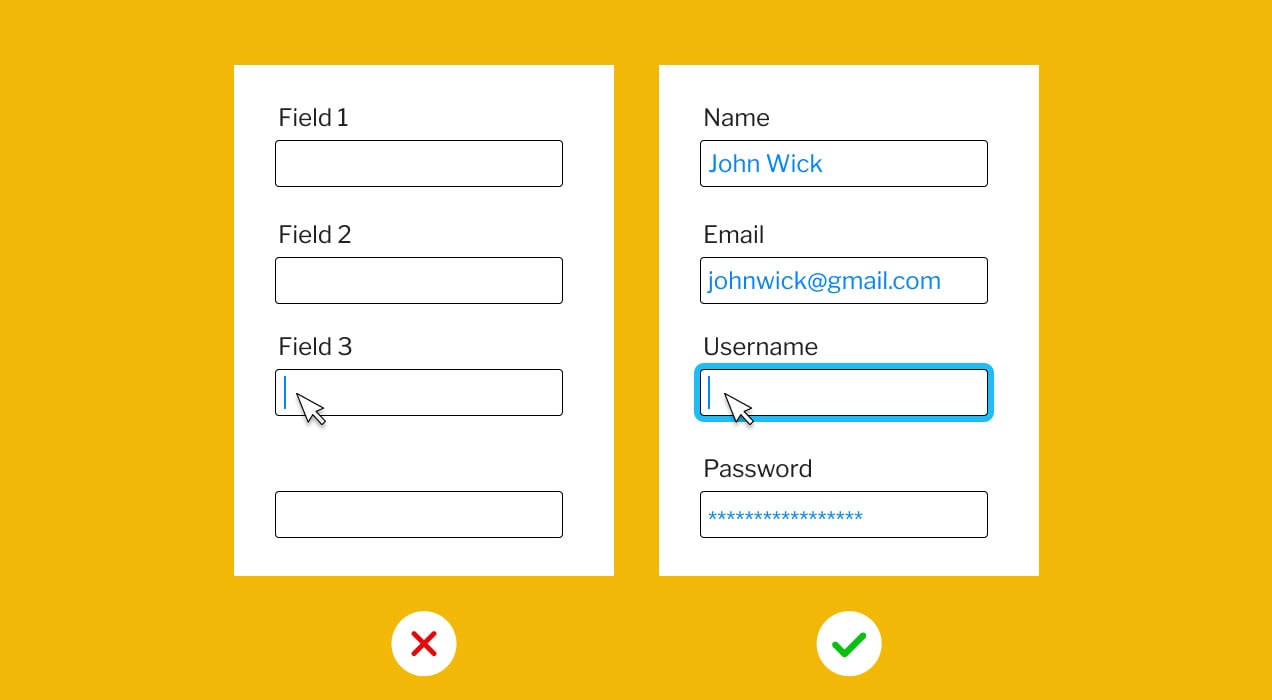
- Unlabeled form fields: Failing to clearly label form fields makes it challenging for users to understand what information to input.
Example: On a job application page, the form fields are labeled as Field 1, Field 2, and Field 3, instead of specifying what information should be entered in each field, leaving applicants unsure about which details to provide, which can result in incomplete applications and frustration.
- Keyboard inaccessibility: Designing your site without enabling keyboard navigation.
Example: Some interactive elements cannot be accessed or operated using only the keyboard, excluding those with motor disabilities.
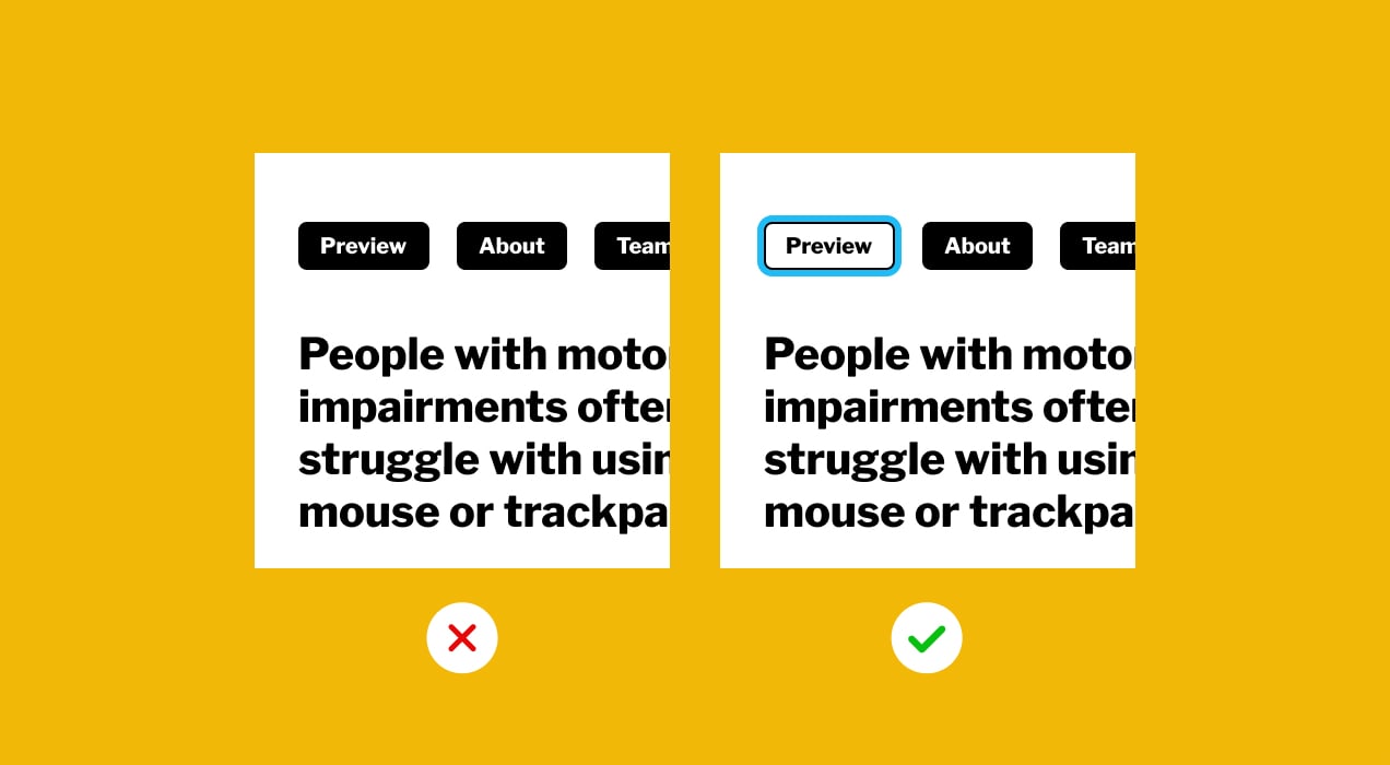
- Missing focus indicators: Without clear focus indicators, keyboard users may struggle to identify where they are on a page.
Example: When navigating an online store’s checkout page using a keyboard, there are no visible outlines or highlights around the selected form fields or buttons, making it difficult for users to know where they are in the checkout process, potentially leading to errors and cart abandonment.
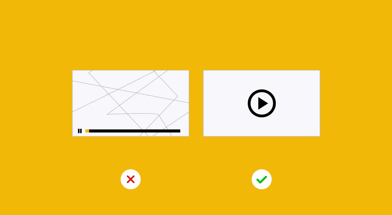
- Auto-playing media: Videos or audio that play automatically can be disruptive and disorienting for users with cognitive or sensory disabilities.
Example: A video on the homepage begins playing with loud audio as soon as the page loads, causing distraction and annoyance.
Neuralab’s Chief Designer, Emanuele Lizzi, spoke about the importance of these topics at the IZZI Power of Education 2023 conference and caught the interest of many attendees. Read more about the conference and watch the video of his presentation on Neuralab’s blog.
Good accessibility examples
Although we’ve been talking about accessibility for years, even the most dedicated web applications still have their problems. However, many are making significant efforts to create accessible content. Various reports that assess web accessibility have validated their efforts.
In early 2023, HubSpot spotlighted 14 websites that nailed website accessibility, from small ecommerce businesses to big brands. They praised BBC for its accessible news site and WWF for its user-friendly pages.
Web Accessibility In Mind’s (WebAIM) 2023 report showed progress, with 96.3% of homepages meeting WCAG 2 standards, which is a slight improvement from 2022’s 96.8%. While they didn’t name specific websites, their data pinpoints the most common mistakes. WebAIM also offers a web accessibility evaluation tool called WAVE to help assess and improve web app accessibility.
Engadget has produced a report for the past three years that focuses on the accessibility of some of the largest web applications. Their 2023 report concluded that “the tech industry still has a lot of work to do regarding accessibility.” However, some progress is noticeable, including the following interesting examples:
- Apple has been a leader in accessibility and general ease of use. This year, they added a feature to iPhones that helps people who are blind, or have trouble seeing, to find doorways and read any signs or words on them.
- Google is working hard to make its tools more inclusive, with several improvements over the past year. One example is Guided Frames, a tool that helps blind or visually impaired people take selfies.
- Microsoft also continues to add new accessibility features to their products. This year, they added automatic captions to videos on LinkedIn and allowed alt-text for advertising images on the platform.
- Amazon introduced many new features and updates this year. One interesting addition was gesture support for Echo Shows. Users can wave or show an open hand to dismiss timers, which is helpful for people who can’t use their voice or prefer not to touch the device.
- Meta also made some improvements this year. Among being named the best place to work for disability inclusion by the Disability Equality Index, in May, they added alt-text for stickers on Facebook and Messenger.
We all know that big companies do this well, but there are also many good, lesser-known examples from the online world. Another great showcase is a WordPress plugin designed for neuralab.net. This plugin uses the AWS Polly service to convert text from blog posts into audio files. Users can listen to, pause, and rewind this audio directly within the blog post.
Another excellent case is Neuralab’s collaboration with the Croatian Academic and Research Network (CARNET). The central focus during the development of the new website was accessibility, which entailed fine-tuning the page layout to ensure it could be used by the widest possible audience. This involved adjusting elements like colors, contrast, and font size, and adding a built-in dyslexia font feature. We wrote about all of our work with CARNET on our blog, and created a visual showcase of the project on Behance.
Building accessibility into your store
Ready to take action? Here are your next steps to kickstart accessibility improvements for your online store:
- Add descriptive alt text to all images on your web application to make them understandable for screen readers.
- Test your web application’s keyboard navigation to ensure users can navigate without a mouse.
- Add captions to videos for deaf and hard-of-hearing users.
- Create and publish an accessibility statement on your web application, outlining your commitment to accessibility.
- Train your team on accessibility standards and best practices.
- Continuously test your web application with assistive technologies and conduct user testing with individuals with disabilities.
And, don’t forget Apple’s advice on accessibility when you’re thinking about any features: “Get it done in more ways than one.”
Making the internet better for everyone
In today’s digital age, accessibility is non-negotiable. It’s about creating an inclusive space where everyone, irrespective of their abilities, can have an enriching shopping experience. We have all the tools at our disposal, and possess the knowledge and responsibility to lead the way. So, let’s champion accessibility, not just as a technical requirement, but as a cornerstone of modern digital retail. The future of ecommerce is accessible. Are you on board?
For over 15 years, Neuralab has been conceiving, designing, and programming web applications for medium and large organizations. Within this niche, they focus primarily on crafting exceptional ecommerce solutions as well as internal applications, large web portals, and online platforms. Neuralab currently boasts a robust team of 25 selected designers, developers, content creators, and product managers, ensuring that they produce the full scope of projects entirely in-house, without outsourcing any part of the process.
Take your store and brand experience to the next level with the help of a certified WooExpert. Neuralab is a Platinum-certified team of creatives and engineers who manage all aspects of ecommerce projects.
Thank you for sharing a comprehensive blog post on the importance of accessibility in ecommerce. Your exploration of barriers, key principles, and a checklist for evaluation provides valuable insights. The benefits of accessibility, along with examples of common mistakes and good practices, create a compelling case. Recognition of industry leaders and actionable steps for improvement further enriches the post. Your call to make the internet more inclusive is both impactful and inspiring.
Best,
Michael
Great summary, Michael. Thanks for sharing your thoughts!
Dear Michael,
Thank you for your comment.
I hope this guide will be helpful to you and many others.
All the best
Ana