Your ecommerce website design has a significant impact on your success: beautiful, well-functioning sites are the expectation, not the exception. Why? Because 89% of customers have switched to a competitor’s business following a poor customer experience.
With countless businesses vying for the same customers, you’re not just competing with your neighbor; you’re going head-to-head with global giants. The key to standing out and succeeding in modern ecommerce? A website that looks amazing and delivers an exceptional user experience.
Whether you’re a small business building your very first ecommerce website or a seasoned entrepreneur looking to improve your site’s appearance and performance, this guide will help you get familiar with the best practices in ecommerce website design and inspire you with some of the top ecommerce website examples from the real-world.
Table of Contents
- 1. Understanding your customers
- 2. Selecting the right ecommerce platform
- 3. Prioritizing mobile-first website design
- 4. Streamlining website navigation
- 5. Keeping your website layout clean and simple
- 6. Choosing high-quality images for ecommerce
- 7. Optimizing your site for fast load times
- 8. Building trust
- 9. Creating a user-friendly checkout
- 10. Choosing payment options
- 11. Prioritizing accessibility
- 12. Harnessing the power of A/B testing
- How WooCommerce can help
- Exceptional ecommerce website design is your gateway to success
Since the focus of this article is on designing and building your ecommerce website, we’ll assume that you already have an idea for the products you’re selling, have a company name, registered your business, created a logo, and have purchased a custom domain name.
If you haven’t done this yet, read this article about starting an online business and then create your brand guidelines before getting started on your ecommerce website design.
Have your online business plan and brand guide all squared away? Great! Let’s look at some winning tips and great ecommerce website design examples.

1. Understanding your customers
Your ecommerce website isn’t just a digital catalog; it’s your storefront, your sales representative, and your brand ambassador, all rolled into one. Every online store wants to make a ton of sales with their website, but you can’t be everything to everyone.
To design your ecommerce store in a way that resonates with your target audience, you’ll first need to understand:
- who they are,
- what they want,
- and how they behave online.
Identifying your customers before you build your online store
First, you’ll want to explore ecommerce website examples from which to draw some inspiration. These can be direct competitors, other brands adjacent to your industry, design examples from theme developers, or ecommerce. research other ecommerce stores who attract the same type of customers that you are hoping to attract.
How popular are those brands? What do their websites do well? Where could they improve? Who follows and interacts with them on social media?
Even if you don’t have empirical data to work with, you can make some educated assumptions by studying similar ecommerce websites and then develop buyer personas that can help direct your erb website design decisions.
Building your customer profiles
If you can build your customer profiles, or personas, from data points, that’s great! But if you’re just starting out, use the following questions to define the customers you’d like to sell to.
Customer demographics
Where do your customers live? What are the most common age groups, genders, range of income, and education backgrounds? Knowing key pieces of demographic information can help you determine if your website needs to be multilingual, use larger font sizes, prioritize display of lower priced and sale items, or modify your brand voice in your product descriptions, videos, and blog posts.
Customer behaviors
When people are shopping on your website, which pages do they visit? How long do they stay? Where do they drop off? This data can inform website design improvements that encourage users to stay engaged and make purchases.
Customer interests
What are your customers passionate about? Are they into outdoor adventures, fashion trends, or gourmet cooking? Understanding their interests allows you to tailor your website content, imagery, and product offerings to align with their hobbies and passions.
If you’ve been running your online store for a while, you’ll be able to gather more specific information about your current customers’ demographics, interests, and browsing behavior. Skip down to our section on analyzing user data and feedback to learn more about using this kind of information to influence your online store’s design.
Once you’ve done some research on your potential customer base and created some buyer personas, you’ll have a framework that can inform your ecommerce website design and content.

2. Selecting the right ecommerce platform
Now that you have an understanding of who your customer is and some generalized website design ideas that might resonate with your target audience, you’ll need to decide which ecommerce platform is right for your needs and goals.
Think of this choice as the cornerstone of your digital business — a foundation upon which your entire online presence will rest. The significance of this decision cannot be overstated, as it will directly impact your website’s performance, scalability, and ability to meet your business’s evolving needs.
Some ecommerce platforms can only be used through the platform’s own hosting services. It can be tempting to use these one-stop services for building your ecommerce website — and in some cases it might be the best fit for your needs. But if you aren’t happy with the hosting, cost, or the available features, you won’t be able to just move your online store elsewhere. You’ll have to rebuild it entirely.
The advantage of starting a business with flexible software
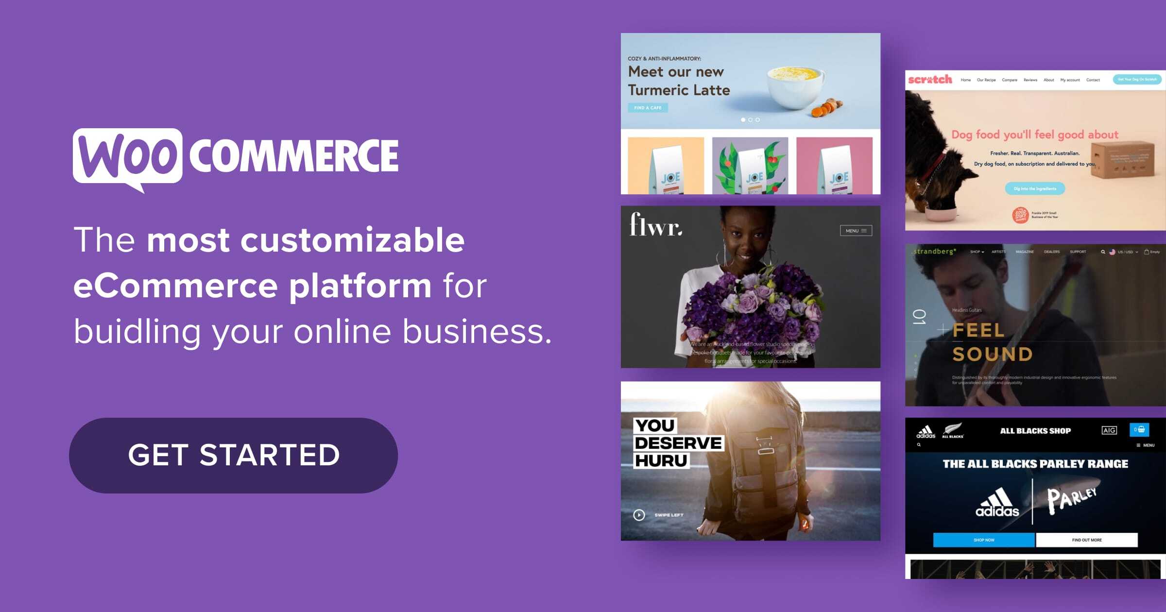
This is where free, open source ecommerce software like WordPress and WooCommerce have the advantage. Because the code is open-source, it means you or your development team can view, modify, and enhance any part of the code to develop the appearance you want and features you need. You are also free to host your ecommerce website anywhere, giving you greater control over the quality and cost of hosting.
Or, if you want the best of both worlds, you can take advantage of Woo Express. This option includes everything you need to run your ecommerce store, along with hosting, a custom domain name, marketing tools, payment options, and more.
Once you’ve gotten to know your target market and you’ve chosen your ecommerce platform, it’s time to get serious about designing your site. In the next few sections, we’ll discuss the important visual design principles as well as technical, security, and performance optimization considerations.

3. Prioritizing mobile-first website design
Online shoppers are increasingly reaching for their smartphones instead of their laptops or desktops. The projected value of mobile retail sales in the United States alone is expected to exceed 700 billion dollars in 2025. With statistics like these, the importance of mobile-friendly, modern design for your ecommerce website cannot be overstated. Frustrating navigation, slow load times, and unresponsive ecommerce website design can drive users away and tarnish your brand’s reputation.
Additionally, Google’s mobile-first indexing means that your website’s mobile version takes precedence in search rankings. To ensure your ecommerce website ranks well, use Google’s Mobile-Friendly Test tool to check if your ecommerce site meets mobile optimization standards and address any issues it highlights.
Using responsive design principles
Responsive design is an approach to website design that uses fluid grids that adapt to different screen sizes. This ensures that your ecommerce website looks great and functions well on devices of all dimensions, from tiny smartphone screens to large desktop monitors.
Some basic elements involved in creating a responsive ecommerce website design include:
- Media queries. Media queries are CSS techniques that allow you to apply specific styles to different screen sizes. With media queries, you can adjust font sizes, spacing, and image sizes to optimize the user experience across various devices. W3Schools has some media query examples if you’re unfamiliar and want to learn more.
- Touch-friendly design. Mobile users rely on touch gestures, so it’s crucial to design buttons, navigation, and other interactive elements that are easily tappable. Elements should be appropriately spaced and sized to prevent accidental clicks.
- Performance optimization. Mobile users often have slower internet connections than desktop users. Therefore, optimizing your website’s performance is paramount. Improve mobile page load times by minimizing image sizes, use browser caching, and implement lazy loading. Google’s PageSpeed Insights tool can help identify areas for improvement.
- Content prioritization. With limited screen real estate on mobile devices, content prioritization is key. Highlight essential product information and calls to action, and consider hiding less important elements behind collapsible menus or tabs.
By using these principles, you can ensure your ecommerce site design performs optimally across all devices, catering to the diverse needs of your audience. Embracing mobile-first website design not only boosts user satisfaction and retention but also helps your ecommerce site maintain a strong presence in the ever-competitive world.

4. Streamlining website navigation
Imagine walking into a well-organized, spacious store where everything is neatly labeled and easy to find. Navigating such a store is a breeze, and you’re more likely to enjoy the shopping experience, right? Well, the same principle holds true for your virtual store.
The user experience (UX) is at the heart of all great ecommerce websites. And at the core of a great UX is intuitive, effortless navigation. Streamlined navigation minimizes the effort required to find products, information, or complete a purchase. When users can easily move around your site, they are more likely to see your site as trustworthy, stay longer, and return in the future.
Creating intuitive menu structures
Part of designing user-friendly website navigation is creating intuitive menu structures. Whether it’s your header, footer, or sidebar menus, there are some key principles to keep in mind when determining how they will display.
- Create a clear hierarchy. Implement a clear and logical hierarchy for your website’s menu. Group related items together under main product categories. For example, a clothing store might have categories like “Men’s”, “Women’s”, and “Accessories”, with subcategories like “Shirts”, “Pants”, and “Hats” beneath them.
- Limit use of categories. Avoid overwhelming users with a long list of menu items. Keep the number of categories manageable to prevent decision fatigue. If your store has a wide range of products, consider implementing mega menus or dropdowns to organize content.
- Use descriptive labels. Use descriptive labels that clearly convey what users can expect to find in each category. Avoid jargon or cryptic terms that might confuse visitors.
Including search and filtering options
A prominent search bar should be found at or near the top of your website. Ensure it’s easily visible and accessible from every page. Users who know what they’re looking for will appreciate the convenience of a search feature.
To further speed up the search process, enable auto-suggestions. As visitors type their search queries, a list of relevant keywords and product names should be displayed to help shoppers find products faster.
Allow users to refine search results by applying filters (e.g., price range, size, color) and sorting options (e.g., relevance, price low to high, popularity). Include your filter and sort menus at the top of your product category pages on mobile. Displaying your filters in a sidebar may be more user-friendly on desktop, but may be cumbersome on mobile.
Jetpack Search is the leading option in the WordPress world. It has all of the powerful, instant results and smart suggestion capabilities described above. Plus, you can customize it substantially to nudge visitors in the right direction and best fit your unique audience. Learn more about Jetpack search for WordPress and WooCommerce.
Creating clear call-to-action (CTA) elements
CTAs are another way that shoppers navigate your website. They literally call the visitor to take action — to make a purchase, read more of an article, or sign up for a newsletter. Your CTAs should stand out on the page, typically through the use of contrasting colors and compelling text. Examples include buttons that say “Buy Now”, “Add to Cart”, “Claim Your Discount”, or “Get Started.”
Maintain consistency in the design and placement of CTAs throughout your website. Use the same colors, styles, sizes, and typography for buttons and linked text. Use color and formatting to indicate whether a CTA is active and clickable, already visited, or inactive. Users should always know where to look when they’re ready to take action and whether the options they want to choose are available to them.
Streamlined website navigation is the compass that guides customers through their ecommerce journey. By focusing on intuitive menu structures, robust search functionality, and clear CTAs, you can create an environment where users can effortlessly explore your offerings and, ultimately, convert into satisfied customers.
5. Keeping your website layout clean and simple
We’re presented with an enormous number of choices and amount of information each time we open our inbox, type in a search term, or scroll through social media. Our lives have enough visual clutter, so a clean and simple website layout can stand out like an oasis in the desert.
The best ecommerce websites offer a visually balanced, clutter-free design that shepherds visitors effortlessly through the online shopping experience.
We know fine-tuning your site can be daunting — but there are plenty of resources to help you along the way. If you’re looking for help with building or customizing your store, hire one of our trusted WooExpert agencies to complete your project.
The benefits of a clutter-free website design
A clean layout eliminates distractions, allowing users to focus on the most important elements — the products you’re selling. It also helps customers find what they are looking for faster and makes shopping online more pleasant.
If you keep your website design well-organized and clutter-free, it will also come across as a trustworthy and professional website. It communicates that you’re a credible online business that takes its brand reputation seriously.
Simplified layouts also tend to load faster, especially for mobile users with limited bandwidth. When your customers spend less time waiting for your site to load and don’t have to scroll or click around to find what they want, they may be more likely to make repeat purchases.
Achieving visual balance with the golden ratio and rule of thirds
One way to help achieve visual balance when designing your ecommerce website is to use the golden ratio and the rule of thirds. It’s one of the key design examples that’s proven successful time and time again. The golden ratio is an ancient mathematical concept and the rule of thirds was initially developed for photography, but they’re just as applicable to website design as they are to other visual disciplines.
The golden ratio uses a spiral shape to plot out ideal dimensions and placement of a variety of rectangles (or, in the case of website design, content blocks) within a frame.

The rule of thirds uses an evenly-spaced grid made up of two vertical and two horizontal lines that form three rows and three columns. Each point where the lines intersect indicates the best placement for subjects or content that you want the viewer to focus on within that frame. It can also direct how you visually weight your content — left, center, right, or fully justified.
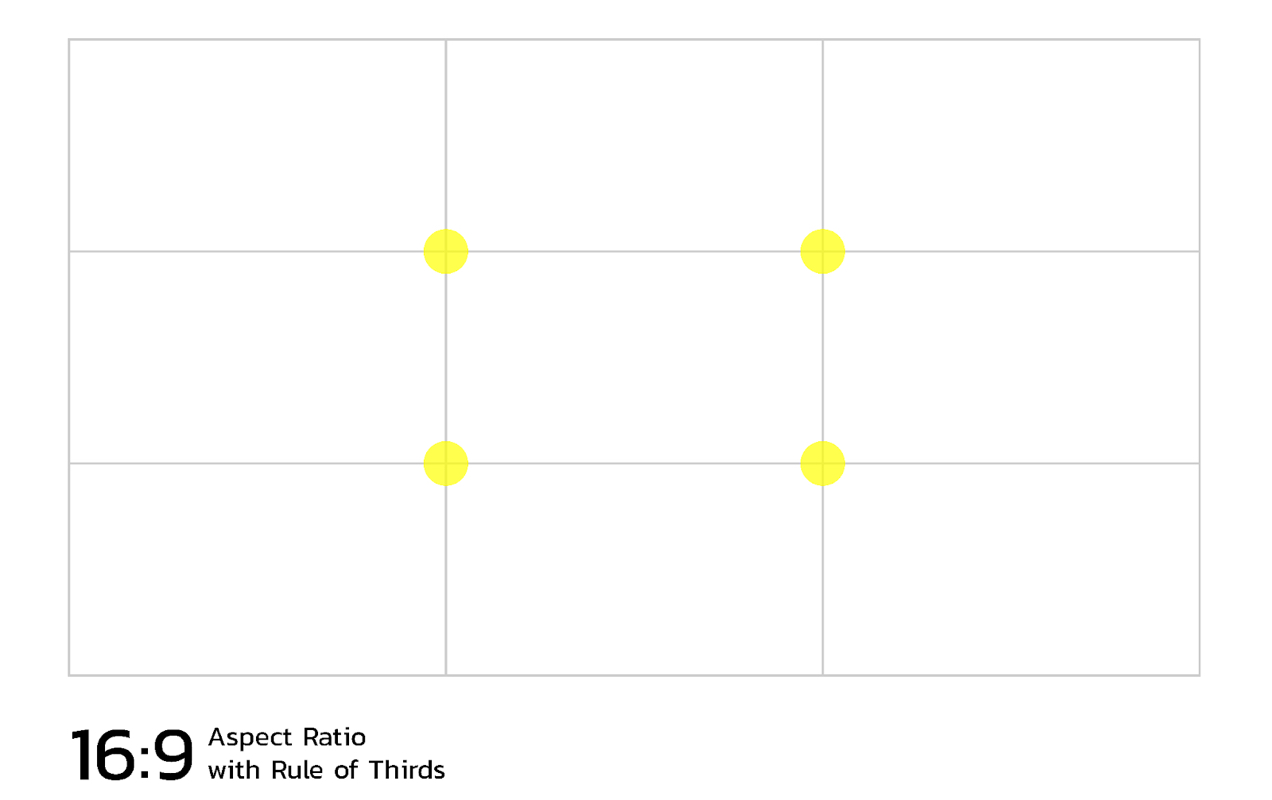
Using the golden ratio and the rule of thirds together, you can create balanced, harmonious layouts that guide the user’s eye to important content and calls to action. For instance, a compelling message at one of the intersecting points of your rule of thirds grid immediately draws the user’s attention and encourages interaction.
Using white space
White space (or negative space) is the empty space between and around elements on a page. It helps create visual breathing room, preventing a cluttered, overwhelming appearance. White space guides the reader’s eye and emphasizes the content that matters most.
Make sure that you give your content plenty of breathing room in your ecommerce website design. Use generous padding and margins between sections, content blocks, and in line breaks while still keeping your important images, text, and CTAs above the fold to minimize scrolling.
When it comes to text, make sure that the space between your letters (kerning) and the space between each line (leading or line-height) is adjusted for the easiest readability.
Selecting a color scheme
Your color palette is a vital part of telling your brand story and ensuring brand recognition across all types of media. It should be established as part of your brand guidelines and a reflection of your brand values.
Keep your focus on simplicity and don’t get carried away with color choices. Select contrasting but complementary colors.
Make sure your color choices for fonts are easily readable on your site’s background color and avoid large swaths of harsh, bright colors.Not sure where to start? HubSpot has a neat tool to help you generate a simple brand kit and color palette.
Choosing a background color
In website design, white space isn’t just the empty space — it’s often literally white. A white background for your ecommerce website doesn’t have to be the only option, but it is probably the best option if you are just starting out and haven’t spent a lot of time tinkering with your brand identity.
While black text on a white background is the easiest for most people to read, it’s perfectly acceptable to choose other color options. Just make sure that they keep a strong contrast with your background color. A dark green on a very light off-white, for instance, may be a great look for a brand selling products made from natural materials, camping gear, or a prepared meal delivery service.
If you want to offer a dark mode version of your site so that visitors can choose which version of your site to use, you can implement prefers-color-scheme in your CSS media queries. If you’re not familiar with coding or markup languages, you can use a plugin like WordPress Dark Mode to achieve the same result.
Depending on what you’re selling on your website, it’s possible that a dark background with light text is a better choice for presenting your products. If you’re not sure, this article on dark UIs might help you determine whether a dark mode website is best for you.
Regardless of which mode you choose, make sure to avoid using busy backgrounds like tiled patterns or complex, high-contrast images — unless you’re going for a 90s retro Geocities type vibe.
Establishing visual hierarchy with typography
While the messaging on your website is important, the way your words look plays a fundamental role in user experience as well. Bold or thin, large or small, narrow or wide, serif or sans-serif, simple or stylized — the shape, size, color, and style of your text influences readability, indicates the importance of the information, and dictates where people place their focus.
There are some good rules of thumb to follow when you’re selecting your font families, deciding on heading and body text sizing, and determining how and where you want this text displayed:
- Limit the number of fonts. Typically, you should choose either one font for all text types or two complementary fonts — one for headings and one for body text. This will help your website maintain a cohesive, clean, and professional appearance. There may be situations where more font styles are called for, but for most brands, sticking to one or two fonts will result in a more optimal user experience.
- Prioritize readability: While decorative fonts can be visually appealing, they may sacrifice readability. Always test fonts to ensure they’re legible on various devices and screen sizes. Both sans-serif and serif fonts can be acceptable options for body text, but there are a lot of choices out there. If you’re feeling overwhelmed, err on the side of caution and use fonts that are considered highly readable and web-safe (likely to be supported across most devices and browsers).
- Use responsive typography. Implement responsive typography to adapt font sizes and line spacing for different screen sizes. This ensures that text remains easily readable on all devices.
- Use different attributes for headings and body text. Using larger font sizes, bold weights, and differing colors for your headings can signify the importance of each heading level and differentiate it from your body text. This aids readers in quickly scanning and understanding your content’s structure.
By reducing clutter and emphasizing clarity and balance in key elements of your ecommerce website design, you create an environment that promotes user engagement and trust. Remember, in the realm of ecommerce website design, simple is almost always better.

6. Choosing high-quality images for ecommerce
Visuals have a profound impact on the success of ecommerce websites. Potential customers can’t inspect your products in person. Instead, you’ll need to rely on photos and videos to tell a story about your products and showcase their benefits, versatility, and real-world applications.
Effective storytelling can boost conversions by helping customers gain confidence in your product’s quality and envision how it can fit into their lives.
Creating exceptional product photos
There are a variety of ways to display your products on your website using photography. Below are some basic principles you should employ when taking any type of product photo:
- Use high-resolution photos. High-quality photos provide an up-close view, allowing customers to scrutinize product details, textures, and finishes. Use a newer smartphone, digital SLR camera, or a professional mirrorless camera to capture your product photos.
- Use even lighting. Whether you’re using studio lighting, a light box, or natural light, make sure that the lighting in your photos adequately shows the details of your product. Harsh lighting with high contrast can obscure important product features.
- Use a contrasting background. Most often you’ll want to use a white sweep to showcase a product, but you may also prefer to use lifestyle shots that show a product in the environment it’s intended for. Many retailers use both types of imagery. Regardless of which style you choose, make sure that your background contrasts with your product so that the visual focus remains on the product and it doesn’t get lost against a similar color or texture.
- Color correct your images. While all screens are color calibrated differently, you should do your best to make sure that the colors in your images match your actual products to the best of your ability. Free tools like Photoshop Express can help you not only color correct your images, but cut them from their backgrounds and do any retouching you might need.
- Include photos from multiple angles. This not only offers a comprehensive view of your product but also builds trust by demonstrating transparency about the product’s condition and features.
- Enable zoom functionality. Implement zoom features that let users magnify product images for even more in-depth examination. This helps replicate the tactile experience of in-person shopping.
- Serve images sized for high resolution displays. Retina and 4K devices display at higher resolution than traditional desktop monitors. While initially introduced on devices like smartphones and tablets, more laptops and desktops have high resolution displays now, so it’s essential to offer images that look crisp and vibrant on all platforms.
Other options for product visuals
- Product videos. Videos bring products to life, allowing customers to see them in action. Consider creating videos that showcase the product being used in real-life situations or highlight its unique features. How-to videos are also a great way to demonstrate how to use your products effectively. This can boost customer confidence and reduce post-purchase inquiries.
- Augmented reality (AR). Implementing an AR extension on your website like CartMagician PRO can help shoppers picture how your products might fit in their space. This is especially useful for home decor, home improvement, office furniture, wall art, and even apparel and accessories. A great example of this is the many online eyewear retailers that use AR features to allow you to virtually try on different styles of frames.
You don’t necessarily need to use every single type of imagery for all product pages in your store — a handful of high-quality photos may be better than going overboard on visual content. It’s up to you to consider what visuals will work best for your store and your customer base.
Learn more about taking amazing product photos.

7. Optimizing your site for fast load times
A website that loads quickly — between zero to two seconds — gets more sales. Shoppers expect instant gratification when navigating your online store. Slow-loading web pages frustrate visitors, leading to high bounce rates and missed conversion opportunities.
Shaving off even a couple of seconds of load time through improved website design can be a game-changer, as the first five seconds has the greatest effect on conversion rates.
Load time isn’t just part of a good user experience; it’s also an important element of search engine optimization (SEO). Search engines like Google factor in page load times when determining search rankings. A sluggish website can lead to lower visibility in search results, while a speedy site enjoys higher ranking and increased organic traffic.
With the rise of mobile shopping, speed is more critical than ever. Mobile users usually have slower connections to the internet to begin with and are particularly sensitive to slow load times. 53% of mobile users will abandon a site that takes longer than 3 seconds to load.
So, how can you ensure that your ecommerce website loads lightning fast? By optimizing images and code, choosing lightweight themes and plugins, utilizing caching and content delivery networks (CDNs), and selecting the right web host.
Optimize images and videos
Having a lot of beautiful, high-resolution images on your ecommerce website is great for showcasing your products and communicating your brand identity, but those images can also take up a huge amount of space and slow down your page load times. As much as possible, use the following techniques to compress your image and video sizes, serve the right sized image for each device, and optimize how and when images and video are loaded.
- Compress images. Use image compression techniques to reduce file sizes without compromising quality. Formats like WebP offer excellent compression while maintaining visual fidelity.
- Implement lazy loading. Implement lazy loading, which loads images only when they come into the user’s viewport, saving bandwidth and improving performance.
- Use responsive images. Serve appropriately sized images based on the user’s device. Mobile users, for example, don’t need to download large desktop-sized images.
Minify and defer your code
Well-optimized code is essential for fast load times. Ensure your website’s code is clean and streamlined, minimizing unnecessary elements. Remove unused scripts and stylesheets to reduce server requests. You can then reduce file sizes of your code by minifying it (basically removing spaces, line breaks, indentations, etc). And lastly, use asynchronous and deferred loading of less important code until after other elements load.
Choose a lightweight theme
Choose a well-coded theme for your ecommerce store that doesn’t go overboard on features. Heavy, complex themes can slow down your site significantly. Lean, efficient themes prioritize performance without sacrificing functionality.
Make sure your theme plays well with your ecommerce platform. Look for recent updates, reviews, and support options from the theme builder.
Use only the plugins you need
While plugins can enhance your ecommerce store’s functionality, they can also bog it down if you’re using too many or they are poorly designed and maintained. Select well-coded plugins from reputable developers and use just the right amount required for your ecommerce business’ needs.
Implement caching
Caching reduces the load on your server by displaying pre-generated content to visitors from frequently accessed data and pages. This improves server response time on those pages, and helps to decrease load times. Some web hosts include server-side caching, but you can also use caching plugins like WP Super Cache.
Note: Caching plugins can sometimes cause conflicts between other caching methods, CDNs, themes, and plugins, so make sure you test on a development or staging site to avoid any issues.
Serve assets from a content delivery network (CDN)
Utilize CDN services like Jetpack CDN to distribute your website’s images, videos, and code across multiple servers globally. This reduces strain on the server and delivers content to users from the nearest server, reducing latency and speeding up load times.
Choose the right web host
Your choice of web hosting can be the make-or-break factor for website speed. Opt for a host geared toward WooCommerce sites and offer managed WordPress hosting. These hosts are optimized for ecommerce and offer features like automatic updates and expert support tailored to your needs.
To learn more about choosing the right web host for your WooCommerce store, consult this guide.
Testing and monitoring
Your website will grow and change over time, so you’ll want to regularly test and monitor its performance to maintain optimal speed. Tools like Google PageSpeed Insights and GTmetrix can analyze your site’s speed, offer suggestions for improvement, and even give you a score reflecting its performance. Regularly run these tests and implement recommended changes to keep your website running at peak speed.
Learn more about speeding up your WooCommerce site.

8. Building trust
When customers visit your ecommerce website for the first time, they’re taking a leap of faith. It’s your responsibility to provide a secure and trustworthy environment that encourages them to make a purchase, become loyal customers, and spread the word to their friends and family.
Making sure the design, flow, and content of your website is well-organized and professional does go a long way to building trust. But there’s a lot more that you will need to do to keep your customers safe and help them feel confident in their purchases.
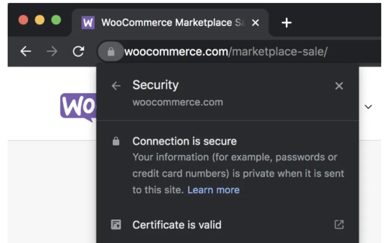
Install an SSL certificate
On the back end of your ecommerce store, adding a Secure Sockets Layer (SSL) certificate is the first step towards creating a secure and trustworthy shopping experience. SSL certificates are essential for encrypting data transmitted between your website and customers.
The presence of an SSL certificate is often indicated by a padlock icon in the browser’s address bar and the “https://” prefix in the URL. This encryption provides assurance that sensitive information, such as credit card details, is protected from interception by malicious actors.
WooCommerce managed web hosts usually come with an SSL certificate by default and all online stores must have one to meet Payment Card Industry Security Standards (PCI DSS). Most payment gateways will not function for your website unless you have an SSL certificate installed.
Use security plugins for added protection
Plugins like Jetpack Security provide comprehensive security features for your ecommerce website. Jetpack Security offers tools for malware scanning, real-time threat detection, brute force attack prevention, and more. By proactively safeguarding your website, you not only protect customer data but also demonstrate your commitment to their security and privacy.
Display trust badges
Trust badges are visual cues that indicate your store’s commitment to security, privacy, and customer satisfaction. These badges reassure customers and reduce anxiety during the purchasing process.
Common trust badges include SSL certificates, payment provider logos (e.g., PayPal, Visa, MasterCard), security certification logos, professional and technical certifications, and membership badges (e.g. certifications for environmental sustainability or memberships in fair trade co-ops). The best ecommerce website examples also display the logos of notable partners or companies who’ve endorsed your work.

Place these badges in highly visible areas of your website. The website footer and header are both common places where visitors might look for this type of information. If you have a lot of logos, you might opt to put them in the footer so they don’t clutter up your main navigation.
Consider placing some of this information on specific product pages near the “add to cart” button, the Checkout page near the “checkout” button, and the Checkout page near the “place order” button. Placing trust badges in high-visibility locations like these will help visitors feel more confident in pressing that “buy now” button.
Leverage customer reviews and testimonials
Encourage customers to leave reviews for products they’ve purchased as well as for your store as a whole. Positive product reviews provide social proof, influence potential buyers, and are an important part of a good marketing strategy. Showcasing these reviews prominently on each product page can help customers better understand your products.
For certain types of products, like clothing and accessories, you might want to encourage user-generated content by letting customers include images and videos in reviews. This creates social proof that helps visitors better determine if your products will meet their needs and expectations.
WooCommerce comes with built-in review capabilities, however there are other review platforms that are popular with many ecommerce sites. Explore some options to see which review management system is right for your business.
9. Creating a user-friendly checkout
Imagine this scenario: a potential customer is visiting your ecommerce store and has spent time browsing your carefully curated products, added items to their cart, and is now ready to make a purchase online. They reach the Checkout page only to find that some form fields are cut off in mobile view, the field labels are too small, and entering payment details is tedious.
Finally, they’ve managed to fill out the checkout form and press the “place order” button only to receive an error message, “You must first create an account before you can make a purchase”.
At this point, your almost-customer says, “Bye!” and abandons their cart, never to return again.
Your checkout process plays a pivotal role in whether your customers complete their transactions. So, let’s explore some ways that you can optimize your checkout for efficiency and user-friendliness.
Experiment with one-page and multi-step checkout
Streamlining the checkout process into a single page with all the necessary steps visible at once can greatly reduce abandonment rates. It simplifies the process and allows customers to see the end goal. You can also include your one-page checkout directly on a product page, reducing the amount of navigation required to make a purchase.
However, your ecommerce business may require more information from customers than can reasonably fit on a one-page checkout. Also, a one-page checkout doesn’t always work as well on mobile devices due to the limited screen real estate. In these cases, you might opt for a multi-step checkout.
A multi-step checkout breaks the purchasing process down into multiple pages that automatically advance step-by-step. For instance, step one might be order review, then you’re presented with a screen to enter billing details, then shipping information, and finally payment information and a button to complete your purchase.
These steps are usually embedded sort of like tabs on a single page so that you’re not enduring a separate page load for each step of the process. Most multi-step checkouts will also save your information as you go so you can navigate back to a previous step to change information.
Breaking the checkout process up into manageable bites can make it feel less overwhelming, especially to first-time customers and those who prefer guest checkout who will likely be manually entering all their information.
Keep checkout distraction-free
Most winning checkout design examples are simple. Eliminating header and footer menus and other extraneous information during checkout can keep customers focused on completing their purchase. Showing sale banners, related products, navigation menus, and other CTAs during checkout can lead to shoppers wandering off and getting lost among the other products on your site.
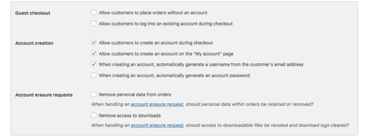
Offer registration and guest checkout options
Most ecommerce business owners would prefer that all their customers register for an account on their website. It makes customer service easier and captures more useful data. But there are benefits to the customer as well.
You can encourage registered customers to save their addresses and payment information securely on your site. This simplifies future purchases, reducing the time and effort required for subsequent transactions. Customers can also access past order details, downloadable files, coupons for which they are eligible, and more from their account dashboards.
However, account creation can also be a barrier to conversion. If it’s a first-time buyer, the customer is in a rush, or they just don’t like the idea of making yet another account somewhere, offering a guest checkout option may help encourage these types of customers to make a purchase. If they have a great experience, they may even come back later to create an account.
Use auto-population on your checkout forms
Implement auto-population of shipping and billing information whenever possible. For example, if a customer enters their ZIP code, automatically populate the city and state fields to reduce manual input.
Some browsers do this automatically if the visitor has enabled it in their settings, but doing this on your website’s end will ensure that this functionality is implemented for every customer.
Prominently display payment and shipping information
Clearly display the total cost, including taxes and shipping fees, early in the checkout process. Surprise charges at the end can lead shoppers to change their minds at the last minute and look elsewhere else to make their purchase.
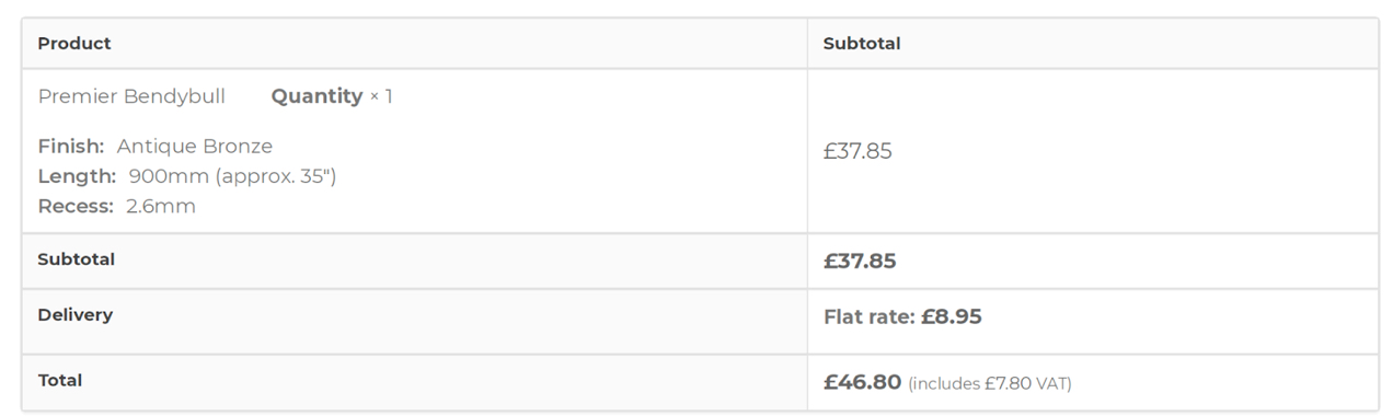
If you have multiple shipping options, make sure they’re easy to find and select and include estimated delivery times.
Experiment with putting some of this information as part of your product page design as well or displaying it in a mini cart that shoppers can easily check from the main menu or header of your website. This way customers know what to expect well before they get to the final checkout page.
WooCommerce extensions for streamlining checkout
If you’re using WooCommerce for your online store, there are a variety of useful extensions you can take advantage of to optimize your checkout process, including:
- WooCommerce Checkout Field Editor. This extension allows you to customize and rearrange checkout fields to match your specific requirements, simplifying the process for users.
- Checkout Enhancer for WooCommerce. This tool offers distraction-free and multi-step checkout options.
- WooCommerce One Page Checkout. If your theme doesn’t support a one-page checkout, consider using this extension to create a single-page checkout process.
- Quick Checkout for WooCommerce. Skip the cart page entirely with a “buy now” button and enable saving multiple addresses to a customer account to save time at checkout.
- Google AutoFill Customer Address. This automatically fills in customer address details during checkout using the Google API.
- WooCommerce Checkout Add-ons. Add up-sells and product add-ons to customize each customer’s checkout experience and increase your average order value.
A streamlined checkout process is the linchpin of successful ecommerce website design. Take the time to optimize your checkout’s features and design to ensure a frictionless path from cart to conversion.
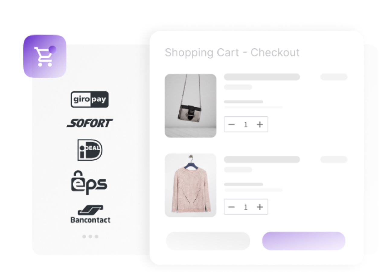
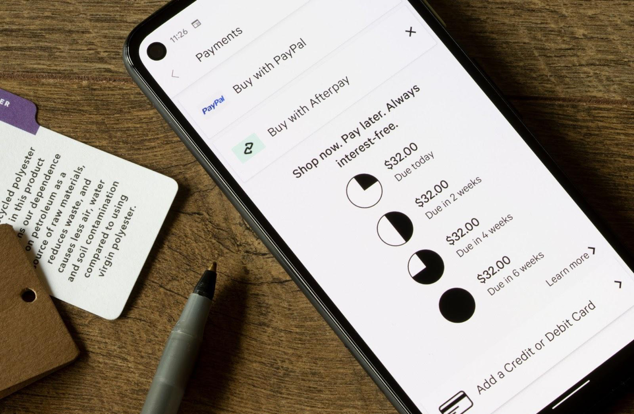
10. Choosing payment options
Payment options are not just a convenience; they’re the gateway to converting visitors into satisfied customers. As online shopping continues to evolve, embracing diverse payment methods has become a necessity for every ecommerce store. Offer a variety of payment options, especially mobile payment methods, and make them readily visible on your website.
Offer mobile payment methods
Digital wallets such as Apple Pay and Google Pay offer a swift and hassle-free way to complete transactions. Customers can make purchases with a single tap, making the checkout process more efficient. They also offer advanced security features like biometric authentication (e.g., fingerprint or facial recognition) to safeguard user data and transactions.
Mobile payments also have a broad global reach, so offering mobile payment options on your online store may have a huge positive impact on your business if you’re also selling online internationally.
Provide payment alternatives
Allowing customers to pay over time, especially for larger purchases, can increase your conversion rates, as more people are able to afford your offer. Keeping tabs of payment status, sending goods before they’re paid for, and other elements of this process might sound complicated or risky.
Thankfully, you can quickly add buy now, pay later options to your WooCommerce store through third-party vendors that take care of all the heavy lifting.
Additionally, people are looking for places to spend cryptocurrency. Adding crypto payment options to your WooCommerce store unlocks new customer segments.
Not a crypto expert? WooCommerce cryptocurrency partners offer done-for-you solutions that don’t require any additional work on your end to achieve the same end result: money (in a familiar currency of your choice) in your bank account.
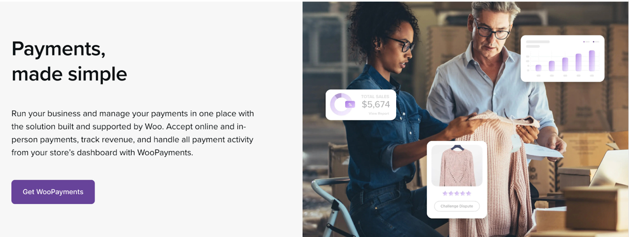
Choose secure payment gateways
Secure payment gateways ensure that your customers’ sensitive payment information is protected. Many gateways often support a wide array of payment methods besides credit and debit cards — like e-checks, bank drafts, and digital wallets — accommodating various customer preferences.
If you’re using WooCommerce, WooPayments is your go-to solution. It’s available in 38 countries, processes payments from credit/debit cards and digital wallets, and accepts transactions in over 135 currencies.
11. Prioritizing accessibility
All ecommerce businesses should prioritize accessibility in their website design. Accessibility ensures that everyone, regardless of their abilities, can access and interact with your online store. It also portrays your brand as socially responsible and considerate of diverse customer needs.
Accessible website design is not just something that boosts business and your brand, though — it’s a legal requirement in many countries. For instance, the Americans with Disabilities Act (ADA) and the United Kingdom’s Equality Act (EQA) require that you meet certain accessibility guidelines if your website is available to the public. Failure to comply with these regulations can result in legal consequences.
Creating an accessible website may seem daunting if you’re never delved into these requirements before. Agency websites’ lists of rules and recommendations can be rather long and tedious. But don’t worry — we’ll cover some of the more important aspects of making your website accessible and highlight tools that you can use to make the process easier.
Tips for making your website more accessible
We touched on some of these elements in the earlier section on visual hierarchy, but there are also some specific things to consider in your ecommerce website design when you’re looking to meet WCAG recommendations.
Choose simplified typefaces and larger font sizes
Select readable sans-serif and serif fonts with clear letterforms. Avoid decorative fonts that may be difficult for some users to decipher.
Ensure that text is of an adequate size, particularly for body text, as those with visual impairments may require larger text to read comfortably. WCAG does not have an official font size requirement but generally speaking, the recommendations are a minimum of 16px for body text on desktop (18px for mobile) and 12px for fine print or default text. Text should be resizable to 200% without a loss of quality.
Use highly-readable text block formatting
Provide adequate line spacing to prevent text from appearing cramped. This improves readability for users with dyslexia or other reading difficulties. The WCAG recommended minimum line spacing is 1.5, but this will depend on your font size. Smaller font sizes will require greater line height than larger fonts.
Use left-justified paragraphs for large blocks of text and limit center justification to single phrases or paragraphs no longer than two sentences.
Add alt text to images
When you add an image to your website, it’s important to include alt text in your html code that provides meaningful and detailed descriptions of your images to users that are visually impaired. This text is essential for screen readers, which are used by individuals with visual impairments to help them understand the images and other graphic elements on your site.

If this sounds a bit tedious — don’t worry. Most ecommerce platforms provide a field in their visual editors to enter your alt text for each image. You don’t have to worry about manually writing out all the html.
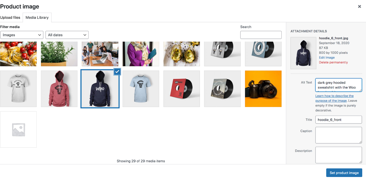
For purely decorative images, use empty alt attributes (alt=””) to indicate that they don’t convey meaningful content.
Use high color contrast
Ensure sufficient color contrast between text and background elements. High contrast makes text more legible for users with low vision or color blindness.
Not sure if your color choices are high-contrast enough? The WebAIM color contrast checker is a great tool to help you determine if your color palette meets accessibility standards.
Implement captions for videos
Adding closed captioning or additional language captioning options on your videos can help individuals who are deaf or hearing impaired and those with a different primary language better understand your products or services. It also provides a useful option for people who just occasionally need to keep the volume off on their devices.
Third-party accessibility solutions
There’s quite a bit more than what we covered above that goes into making a truly accessible website. If you’re worried about meeting compliance standards for your country and the task seems overwhelming, you can add some third-party tools to your website to provide accessibility features. Some options you may want to explore include:
- Recite.me. Offers features like screen reader adjustments, text-to-speech, and translation services to enhance accessibility.
- AccessiBe. Provides AI-driven solutions that automatically adjust websites to meet accessibility requirements.
- UserWay. Offers an accessibility widget that allows users to personalize their browsing experience, including font size, color schemes, and more.
- Equally.ai. Uses AI to scan and remediate accessibility issues on your website, ensuring compliance with accessibility standards.

12. Harnessing the power of A/B testing
Your website isn’t a static entity — it’s a dynamic, living platform that can always be improved. By systematically testing and optimizing website design elements, and by analyzing user data and feedback, you can ensure that your website remains a dynamic and effective platform that meets the ever-evolving needs and preferences of your audience.
What is A/B testing?
A/B testing is the process of presenting two or more different experiences to customers and analyzing the difference in performance. It helps you to identify pain points in your website’s UI, content, and design. By addressing these issues, you will be able to create a more seamless and enjoyable experience for your visitors and boost sales.
What can you A/B test?
It’s important not to make too many sweeping changes between each set of pages or experiences that you’re testing. If you make too many changes, you won’t know exactly which elements are responsible for the increase or drop in effectiveness. Here are a few things you can test:
- Headlines and copy. Test different headlines, product descriptions, and call-to-action (CTA) text to determine which wording resonates best with your audience.
- Images and product displays. Experiment with product images, including size, quality, and placement. You can also test different display formats such as grids vs. lists.
- Color schemes and buttons. Colors can evoke emotions and influence user behavior. A/B test variations in color schemes, button styles, and their impact on conversions.
- Page layouts. Test different layouts, navigation menus, and content arrangements to optimize the overall flow and visual appeal of your pages.
- Pricing strategies. Experiment with pricing structures, discount offers, and pricing displays to find the sweet spot that maximizes revenue.
- Checkout flows. Experiment with distraction-free checkout, one-page checkout, multi-step checkout, and how much information is required with each one.
Analyzing user data and feedback
The journey to creating a great ecommerce website doesn’t have an endpoint — it’s an ongoing process of refinement and optimization. Using the following strategies and tools, you can collect a wide array of useful details about your customers and analyze the data to help direct site design changes.
- Google Analytics. Google Analytics provides data on users’ age, gender, location, interests. It can also track and report browsing behavior.
- Analytics plugins. If you’re running an ecommerce site with WooCommerce, the WooCommerce Customer History extension can be a useful tool for learning how your customers browse your store. See which pages customers visit before they make a purchase and track the lifetime value of each customer. You may want to tailor your website design to the customer demographics that are the biggest spenders in your store.
- Conversion funnel analysis. Analyze your conversion funnel step by step. Identify where users drop off and make adjustments to improve the flow and reduce friction.
- Email marketing tools. Use email marketing software like MailPoet to add newsletter opt-in forms to your ecommerce website to collect customer information. You can ask customers to enter specific details like their birthday and product categories they are interested in.
- Customer surveys. After a purchase, send post-purchase customer surveys to gather information directly from users. Ask about their preferences, interests, and why they chose your products or services. Free tools like Crowdsignal (which is built by the makers of WordPress.com), SurveyMonkey, or Google Forms, can assist in collecting this data.
- Social media integrations. If your ecommerce website is connected to your social media accounts, you can access some demographic data from these platforms. Additionally, social media engagement and user behavior can provide insights into your customers’ interests and preferences.
- Website registration and user profiles. Encourage visitors to create accounts or profiles on your WordPress site. If you’re using WooCommerce, the Registration Form Fields extension gives you the ability to add fields for any kind of additional information you’d like to collect during the registration process. Customers can also update their profiles over time.
- Heatmap tools. Heatmap tools like Clicky and Crazy Egg can provide insights into user behavior by visualizing where they click, move, and spend the most time on your website. While they don’t directly collect demographic data, they offer valuable insights for optimizing user experience.
Note: Remember to prioritize user privacy and adhere to data protection regulations when collecting and storing user data.
How WooCommerce can help
WooCommerce offers a robust platform to avoid typical online marketplaces and instead build your very own elegantly-designed ecommerce store that not only looks fantastic but also converts visitors into life-long customers. Out of the box, it provides the tools and flexibility you need to create an exceptional online shopping experience. It also offers an array of free and paid extensions to help tailor your store to your exact needs.There are other important areas where WordPress and WooCommerce have an advantage over other solutions, including:
- The ability to host your site just about anywhere. This approach empowers you, the store owner, with unprecedented control over your website’s design and functionality.
- The option to choose a more streamlined setup. WooExpress is a hosted WooCommerce solution that reduces the steps required to get started and comes with a number of essential tools to launch your first successful store.
- Excellent documentation and informative articles. WordPress and WooCommerce have detailed how-to guides and documentation, tutorials, forums, and other ecommerce resources to help you implement new features, troubleshoot issues, and stay up-to-date with the latest trends in ecommerce.
- Highly-customized design and functionality. Whether you want a sleek, minimalist website design or a feature-rich powerhouse, the options are virtually limitless. Just between WooCommerce and WordPress, there are extensive libraries of themes and extensions, allowing you to tailor your website to your exact specifications.
- A vast user and developer community. If you have questions, it’s easy to find answers from other users and developers online or through in-person meetup groups in your area. If you can’t find the themes or plugins you need for your ecommerce store on WordPress.org or the WooCommerce marketplace, you can look to independent developers or companies that specialize in creating themes and plugins. If what you’re looking for hasn’t been built yet, you can hire a WooExpert or find a developer on Codeable to help you build it.
As your ecommerce business grows, keep in mind that the demands on your ecommerce site will grow with it. With WordPress and WooCommerce, you can seamlessly expand your online store’s capabilities using the best ecommerce website builder available.
If you’re already running a high-volume WooCommerce store and looking for enterprise hosting to take your ecommerce business to the next level, WooCommerce offers that, too.
Still comparing ecommerce platforms? See why Woo is the best BigCommerce alternative, and see how it stacks up against Shopify, Etsy, Magento, eBay and Amazon, and Patreon.
Exceptional ecommerce website design is your gateway to success
Your ecommerce website is your virtual storefront and its design wields immense power in determining your success. Throughout this journey, we’ve uncovered 12 crucial tips for achieving great ecommerce website design and, by extension, unlocking your best chance at success when you start selling online.
With these insights at your disposal, it’s time to build an online store that truly shines. Remember to research other ecommerce website examples and prioritize content organization, use high-quality images, focus on accessibility, build trust with your customers, optimize page speed, and continuously refine your website design through A/B testing.
Your ecommerce site is always a work in progress. By following this guide and using a powerful ecommerce platform like WooCommerce, you’re not merely designing a website; you’re crafting an online destination that captivates, converts, and excels.
Your customers are waiting, and your success is within reach. Start today and make your mark in the digital world.
I am new to this and everytime I have tried to get help there isn’t any how much is it to get it done and built professionally
Hi Tony!
If you have specific questions, you can submit a support ticket here: https://woocommerce.com/my-account/contact-support/
If you’re looking to hire a developer to help, check out our WooExperts library: https://partners.woocommerce.com/English/marketplace/ It’s full of trusted experts, and you can filter the list by your requirements and budget.