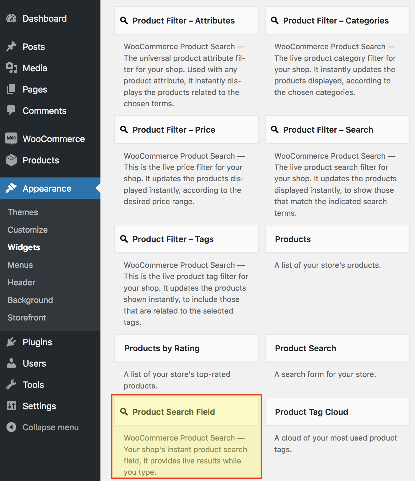
Legacy Widget
↑ Back to topAs of WordPress 5.8, the Block Widgets Editor replaces the previous widgets administration. The widget described here is available as a Legacy Widget when using the new Block Widgets Editor. However, to maintain full widget settings functionality, you must install the Classic Widgets plugin which restores the previous (“classic”) WordPress widgets settings screens.
This page describes a Legacy Widget. With the Block Widgets Editor, we recommend to use the corresponding Product Search Field block instead. See the Blocks page for an overview of all available blocks with the extension.
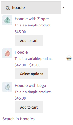
The WooCommerce Product Search extension features the Product Search Field widget that provides instant search results as you type in its search field.
 Use this widget anywhere on your site to allow customers to find and buy a product. With an online shop, it makes sense to offer this search facility prominently and on any page of the site.
Widget Settings
↑ Back to top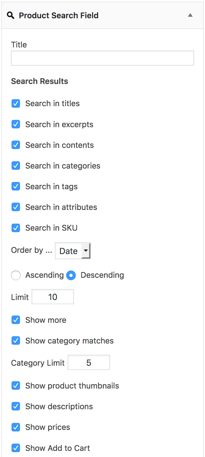
- The Title field allows you to display a title above the search field.
- Search Results – You can determine where the search will try to find matches. This includes options to search in product titles, excerpts (i.e. a product’s short description), the page contents of products, their related categories, related tags, related product attributes and a product’s SKU.
- Order by … The search results can be displayed in ascending or descending order of their date (when a product was created), the product’s title, the product ID, its SKU, popularity (sales), rating or – (unspecified order).
- Limit – This determines how many results are displayed and the default is to display up to 10 results.
- Show more – With this option enabled and when there are more products that match the search than are displayed, a link that leads to the search results is displayed.
- Show category matches – If this is checked, links to categories that contain matching products are included.
- Category Limit – Combined with the former option, this limits the number of categories displayed. By default, the widget will produce links to up to 5 matching categories.
- Show product thumbnails – If this is enabled, the product thumbnails will be displayed.
- Show descriptions – This will show the shortened description for each product. These are derived from the product’s page content or from its short description – the General settings provide universally applied options to shorten titles and descriptions and whether to use short descriptions or not.
- Show prices – This option enabled will show the prices for each product.
- Show Add to Cart – If this is enabled, the corresponding button “Add to Cart”, “Select options” etc. is added to each result.
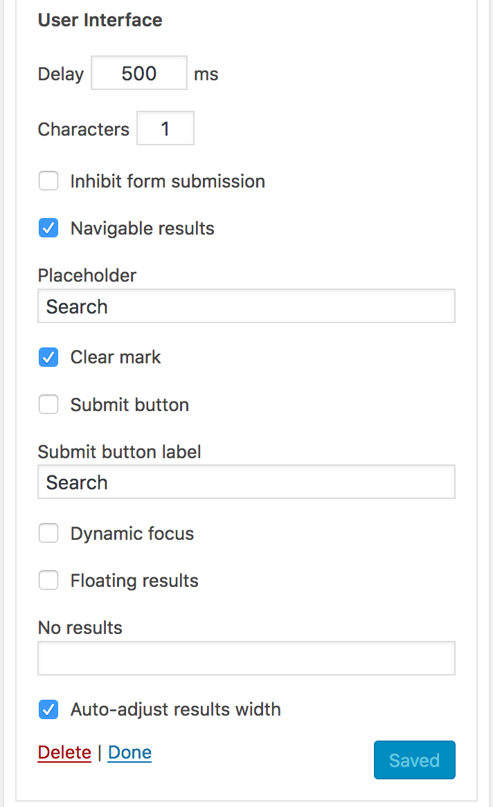
- Delay – This option determines how quickly the search will be launched. After you type something in the search field, the search is launched to check for results. If the field reacts too quickly, it will result in a rather odd experience for who is searching. The default value is 500 ms, i.e. half a second after you stop typing and the search begins.
- Characters – Here you can set the minimum number of characters for a search to start.
- Inhibit form submission … – If checked, pressing the Enter key will not submit the search form.
- Navigable results – With this enabled, it means that you can use the cursor keys to navigate through the search results.
- Placeholder – The Placeholder is some text that is shown when nothing has been input in the search field.
- Clear mark – This option is used to display a clickable action element that is used to clear the content of the search field.
- Submit button – This allows you to show a Submit button.
- Submit button label – Combined with the former option, determines what text is shown on the Submit button.
- Dynamic focus – With this option enabled, the search results are shown or hidden when the search field gains or looses focus (gaining focus usually means when the cursor is blinking inside the search field).
- Floating results – This option sets whether the search results are shown “floating” below the search field. If enabled, the list of results will float above other content below the search filter. Otherwise it will make itself fit between the search field and whatever is below it (it will push the content below it).
- No results – Here you can input the text to be shown when there are no results matching the current search.
- Auto-adjust results width – This option has no effect and is not necessary as of version 2.11.0 and will be removed. – This will make the width of the search results list fit that of the search field to provide a coherent appearance.
- Height – This setting determines the height of the results container. It will adopt the full content height by default, meaning that the height of the results will be as much as needed to show all results. If the height is limited by indicating a number following an allowed CSS unit* – for example 240px – this will be taken as the maximum height of the results and the container will be scrollable instead of extending to accommodate all. *Allowed CSS units: px, mm, cm, in, pt, pc, em , ex, ch, rem, vw and vh.
- WPML Language Filter – Enable it to show results for the current language, disable it to include matches in all languages.
Related General and Thumbnail Settings
↑ Back to top- The General settings provide universally applied options to shorten titles and descriptions and whether to use short descriptions or not.
- The size of the thumbnails displayed can be adjusted in the Thumbnails section of the settings.