This section focuses on the search filter feature provided by the Product Filter – Search widget, its equivalent [woocommerce_product_filter] shortcode or the corresponding API function. We will be exploring how to change the look and feel of it, and indistinctively refer to the Product Filter – Search whether generated by the widget or any other means. To clarify, this field should not be confused with the live search field for which we provide guidance on customization under Product Search Field. Here is an example of HTML generated typically for this field:
<div id="product-filter-search-0" class="product-search product-filter product-search-filter-search">
    <div class="product-search-form">
        <form id="product-filter-search-form-0" class="product-search-form " action="http://example.com/shop/" method="get">
            <input id="product-filter-field-0" name="ixwpss" type="text" class="product-filter-field" placeholder="Search" autocomplete="off" value="">
            <input type="hidden" name="title" value="1">
            <input type="hidden" name="excerpt" value="1">
            <input type="hidden" name="content" value="1">
            <input type="hidden" name="categories" value="1">
            <input type="hidden" name="attributes" value="1">
            <input type="hidden" name="tags" value="1">
            <input type="hidden" name="sku" value="1">
            <noscript><button type="submit">Search</button></noscript>
            <span class="product-search-filter-search-clear" style="display:none">Clear</span>
        </form>
    </div>
    <div id="product-filter-results-0" class="product-filter-results"></div>
</div>
Please note that the element IDs might be slightly different on your setup and dependent on the page configuration and templates. For most cases tough, the IDs used above should concur with those on your site. In what follows, we have prepared examples that are aimed at helping you master the style customizations for the Product Search – Filter.
- Styling the Field
- Changing the Loader Icon
Styling the Field
↑ Back to top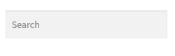 These are the CSS rules we apply:
#product-filter-field-0 {
    border: solid 4px #cc33ff;
    border-radius: 8px;
    background-color: #fff;
    color: #3366aa;
    font-size: 18px;
    font-weight: bold;
    padding: 8px 8px 8px 28px;
    outline: none;
}
With the above rule applied, the field now looks like this:
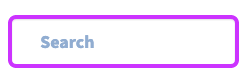 Now, with a second CSS rule we will add a search icon. Note that we are using an icon from the font Font Awesome 5 Free which is included with the extension’s resources.
#product-filter-search-form-0::before {
    display: inline-block;
    font-style: normal;
    font-variant: normal;
    font-weight: normal;
    line-height: 1;
    font-family: 'Font Awesome 5 Free';
    font-weight: 900;
    vertical-align: baseline;
    content: "\f002";
    position: absolute;
    top: 1.3em;
    left: 1em;
    color: #33bb33;
}
With this second rule added, our field now also shows a search icon:
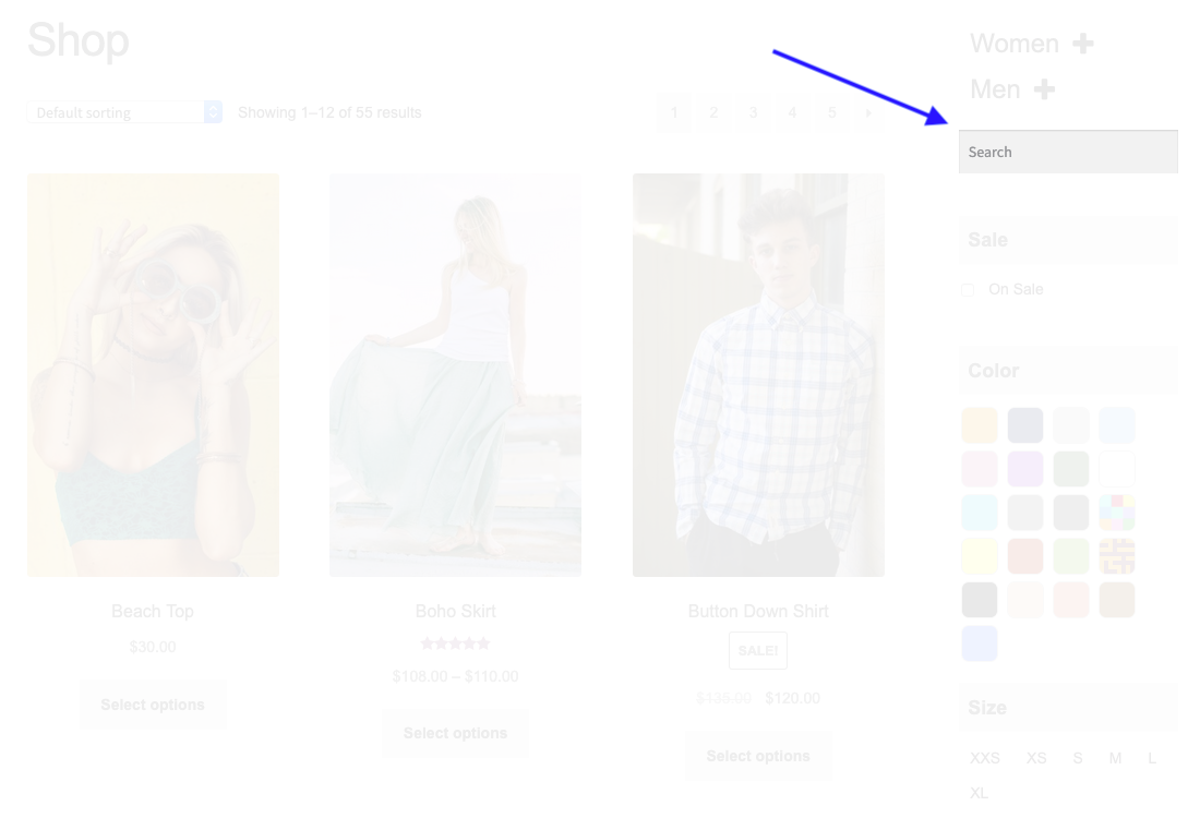
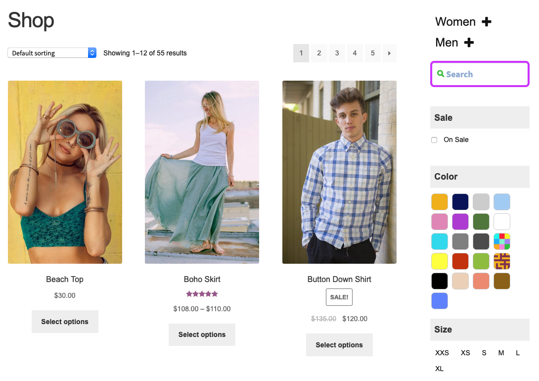
 Let’s have a look at it within the context of our demo store …
 Yeah, pretty bright! And it was really easy, too!
Remember that you can add your customized CSS rules to your child theme’s stylesheet or use the inline stylesheet feature provided by the extension.
Yeah, pretty bright! And it was really easy, too!
Remember that you can add your customized CSS rules to your child theme’s stylesheet or use the inline stylesheet feature provided by the extension.
Changing the Loader Icon
↑ Back to top.blinker class.
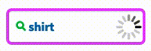
So here’s an example of what we want it to look like …
 To achieve that, we simply add the following CSS rule to our child theme’s stylesheet:
.product-search-form input.blinker {
    background-image: url( 'custom-loader-icon.gif' );
    background-position: right 8px center;
    background-repeat: no-repeat;
    background-size: 24px;
}
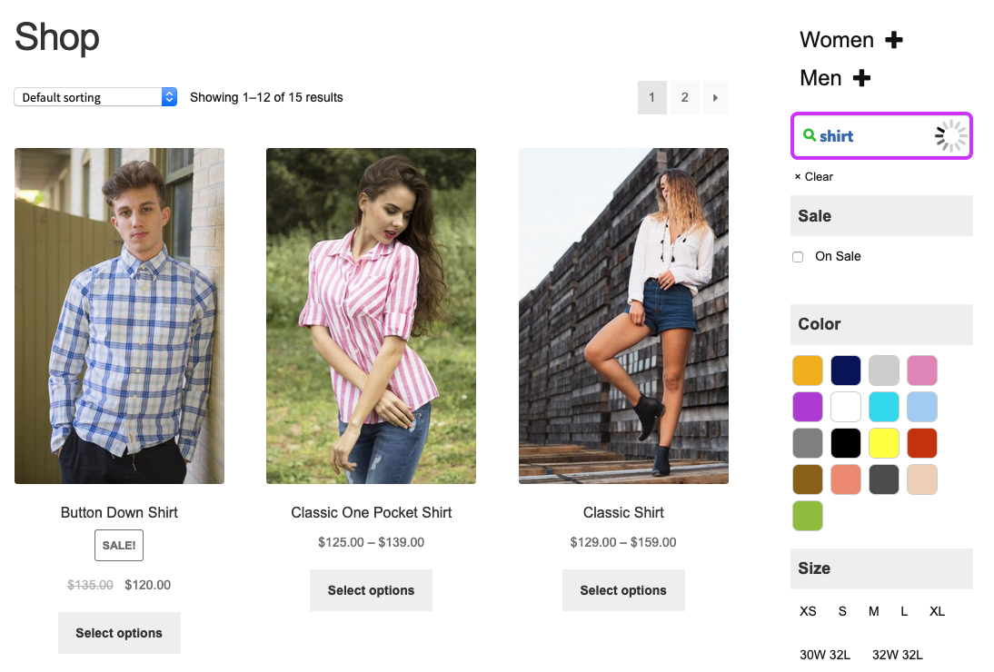
Here is an example of our chosen new loader icon shown on the field within the context of our demo shop.